Map Overlays
One of the strengths of the R programming language is the amount of packages that are readily available.
One such package that is great for data visualizations is ggplot2 as it has great default aesthetics and integrates well with other visualization packages.
Average Income
library(RCurl)
library(xlsx)
library(zipcode)
library(ggmap)
library(ggplot2)
# load file from URL
urlfile <-'http://www.psc.isr.umich.edu/dis/census/Features/tract2zip/MedianZIP-3.xlsx'
destfile <- "census20062010.xlsx"
download.file(urlfile, destfile, mode="wb")
census <- read.xlsx2(destfile, sheetName = "Median")
head(census)
census <- census[c('Zip','Median..')]
names(census) <- c('Zip','Median')
head(census)
census$Median <- as.character(census$Median)
census$Median <- as.numeric(gsub(',','',census$Median))
head(census)
data("zipcode")
census$Zip <- clean.zipcodes(census$Zip)
census <- merge(census, zipcode, by.x='Zip', by.y='zip')
destfile <- "census20062010.xlsx"
download.file(urlfile, destfile, mode="wb")
census <- read.xlsx2(destfile, sheetName = "Median")
head(census)
census <- census[c('Zip','Median..')]
names(census) <- c('Zip','Median')
head(census)
census$Median <- as.character(census$Median)
census$Median <- as.numeric(gsub(',','',census$Median))
head(census)
data("zipcode")
census$Zip <- clean.zipcodes(census$Zip)
census <- merge(census, zipcode, by.x='Zip', by.y='zip')
# Set map as US
map<-get_map(location='united states', zoom=4, maptype = "terrain", source='google',color='color')
print(head(census,5))
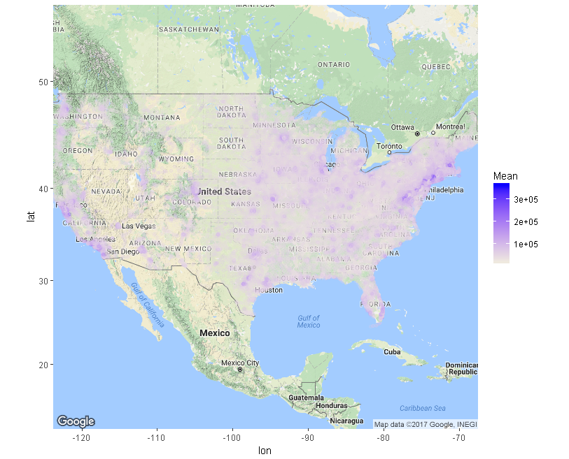
ggmap(map) + geom_point(aes(x=longitude, y=latitude, show_guide = TRUE, colour=Median),data=census, alpha=.15, na.rm = T) + scale_color_gradient(low="beige", high="blue")
print(head(census,5))
ggmap(map) + geom_point(aes(x=longitude, y=latitude, show_guide = TRUE, colour=Median),data=census, alpha=.15, na.rm = T) + scale_color_gradient(low="beige", high="blue")
Life Expectancy by State

up <- map_data("state")
file <-read_excel(path='C:/Users/pat/Desktop/mortality_risk.xlsx')
file <- file[c('state','life__expectancy')]
file <-na.omit(file)#remove missing data
file <- mutate(file, state = tolower(state))
# life_expectancy variable must be stored as numeric
file$life__expectancy <- as.numeric(file$life__expectancy)
file$life__expectancy
file$life__expectancy
# create ggplot map, set region and color, then overlay data
g <- ggplot()
g <- g+geom_map(data = up, map = up, aes(x=long, y=lat, map_id=region),
fill="#ffffff", color="#ffffff", size=.15)
g
g <- g + geom_map(data=file, map=up, aes(fill=life__expectancy, map_id=state), color="#333333", size=0.15)
g
g <- g+geom_map(data = up, map = up, aes(x=long, y=lat, map_id=region),
fill="#ffffff", color="#ffffff", size=.15)
g
g <- g + geom_map(data=file, map=up, aes(fill=life__expectancy, map_id=state), color="#333333", size=0.15)
g
Life Expectancy by County
file <-read_excel(path='C:/Users/pat/Desktop/mortality_risk.xlsx')
file <- file[c('_region', '_subregion','_life_expectancy')]
names(file) <- c('subregion', 'region', 'life_expectancy')
file <- mutate(file, region = tolower(region), subregion = tolower(subregion))
file$life_expectancy <- as.numeric(file$life_expectancy)
summary(file)
# get map data for US counties
county_map <- map_data("county")
#merge mortality and county_map
mortality_map <- merge(county_map, file, by.x=c("region", "subregion"), by.y=c("region", "subregion"), all.x=TRUE)
mortality_map <- arrange(as.data.frame(mortality_map), group, order)
up<-map_data("county")
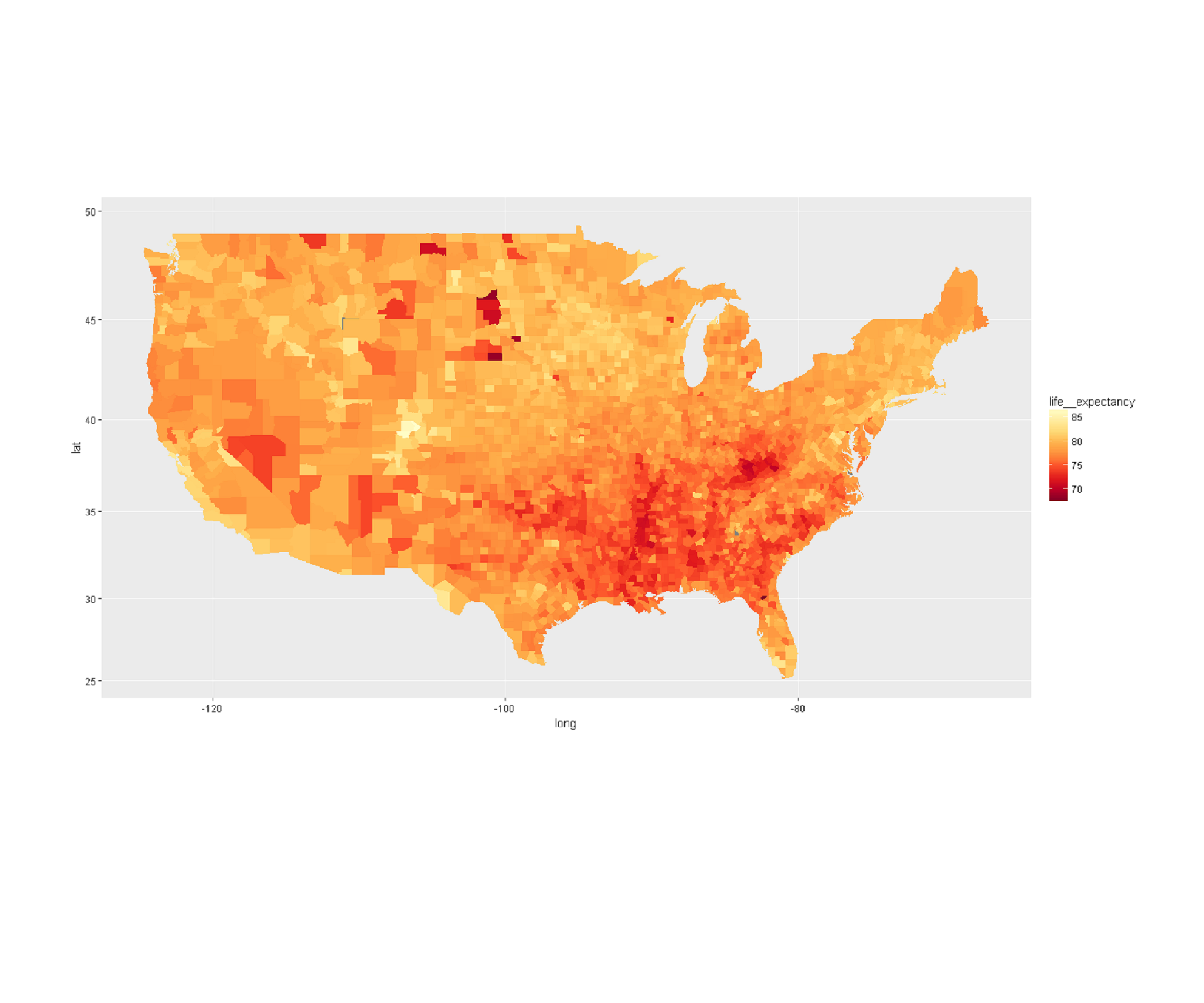
ggplot(mortality_map, aes(x=long, y=lat, group = group, fill = life_expectancy)) +
geom_map(data=mortality_map, map=up, aes(fill = life_expectancy, map_id = region))+
geom_polygon()+ coord_map() +
scale_fill_gradientn("life__expectancy" ,colours=rev(brewer.pal(9,"YlOrRd")))
mortality_map <- arrange(as.data.frame(mortality_map), group, order)
up<-map_data("county")
ggplot(mortality_map, aes(x=long, y=lat, group = group, fill = life_expectancy)) +
geom_map(data=mortality_map, map=up, aes(fill = life_expectancy, map_id = region))+
geom_polygon()+ coord_map() +
scale_fill_gradientn("life__expectancy" ,colours=rev(brewer.pal(9,"YlOrRd")))
Data Plots
Plotting data is a pretty standard way of visualizing data, but it can be implemented in various fashions which can prove rather powerful.
Scatter Plot
# Calculate correlation coeficient for the differnt explanatory variables and round to 3 decimal place
cors<-c(round(cor(batting$DOUBLE, batting$R), digits=3), round(cor(batting$TRIPLE, batting$R), digit=3), round(cor(batting$HR, batting$R), digits=3), round(cor(batting$SB, batting$R), digits=3))
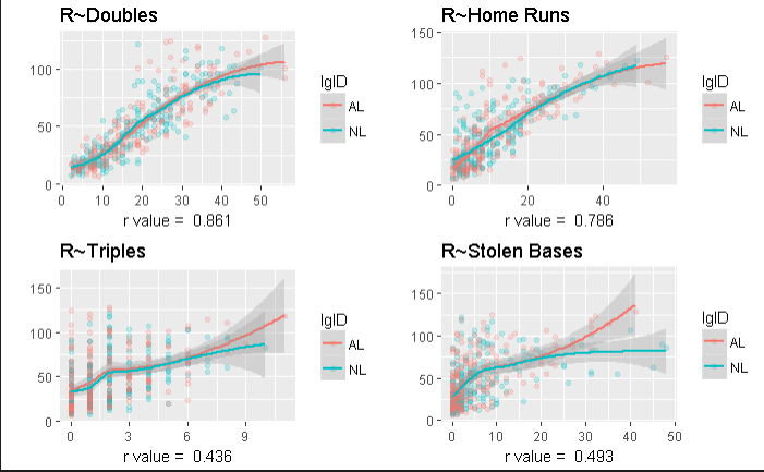
# Create plot of Runs ~ double, triples, home runs, and stolent bases so I can compare how each one correlates with number of runs scores
# I also split the data up abased on the american leauge and national leauge so I could see if there was any significant differece between the two
# I also split the data up abased on the american leauge and national leauge so I could see if there was any significant differece between the two
r_dub<-ggplot(batting, aes(x=DOUBLE, y = R, color=lgID)) + geom_point(alpha=.2) + geom_smooth(alpha=.3, size=1) + ggtitle("R~Doubles") + xlab(paste("r value = ", toString(cors[1]))) + ylab ("")
r_trip<-ggplot(batting, aes(x=TRIPLE, y = R, color=lgID, lab="balls")) + geom_point(alpha=.2) + geom_smooth(alpha=.3, size=1) + ggtitle("R~Triples") + xlab(paste("r value = ", toString(cors[2]))) + ylab ("")
r_hr<-ggplot(batting, aes(x=HR, y = R, color=lgID)) + geom_point(alpha=.2) + geom_smooth(alpha=.3, size=1) + ggtitle("R~Home Runs") + xlab(paste("r value = ", toString(cors[3]))) + ylab ("")
r_stolen<-ggplot(batting, aes(x=SB, y=R, color=lgID)) + geom_point(alpha=.2) + geom_smooth(alpha=.3, size=1) + ggtitle("R~Stolen Bases") + xlab(paste("r value = ", toString(cors[4]))) + ylab ("")
r_trip<-ggplot(batting, aes(x=TRIPLE, y = R, color=lgID, lab="balls")) + geom_point(alpha=.2) + geom_smooth(alpha=.3, size=1) + ggtitle("R~Triples") + xlab(paste("r value = ", toString(cors[2]))) + ylab ("")
r_hr<-ggplot(batting, aes(x=HR, y = R, color=lgID)) + geom_point(alpha=.2) + geom_smooth(alpha=.3, size=1) + ggtitle("R~Home Runs") + xlab(paste("r value = ", toString(cors[3]))) + ylab ("")
r_stolen<-ggplot(batting, aes(x=SB, y=R, color=lgID)) + geom_point(alpha=.2) + geom_smooth(alpha=.3, size=1) + ggtitle("R~Stolen Bases") + xlab(paste("r value = ", toString(cors[4]))) + ylab ("")
# Here I use multiplot to plot the different scatterplots in the same pane
multiplot(r_dub, r_trip, r_hr, r_stolen, cols =2)
Paralell Plot
# load Mass library and use summary to inspect data
library(MASS)
summary(iris)
summary(iris)
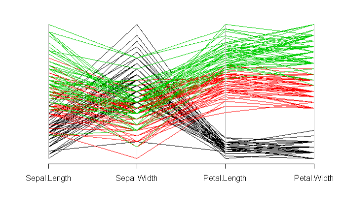
# use paracoord function to plot data across petal/septal length with color definied by species.
parcoord(iris[c("Sepal.Length", "Sepal.Width", "Petal.Length", "Petal.Width")], col = iris$Species)
Time-Series
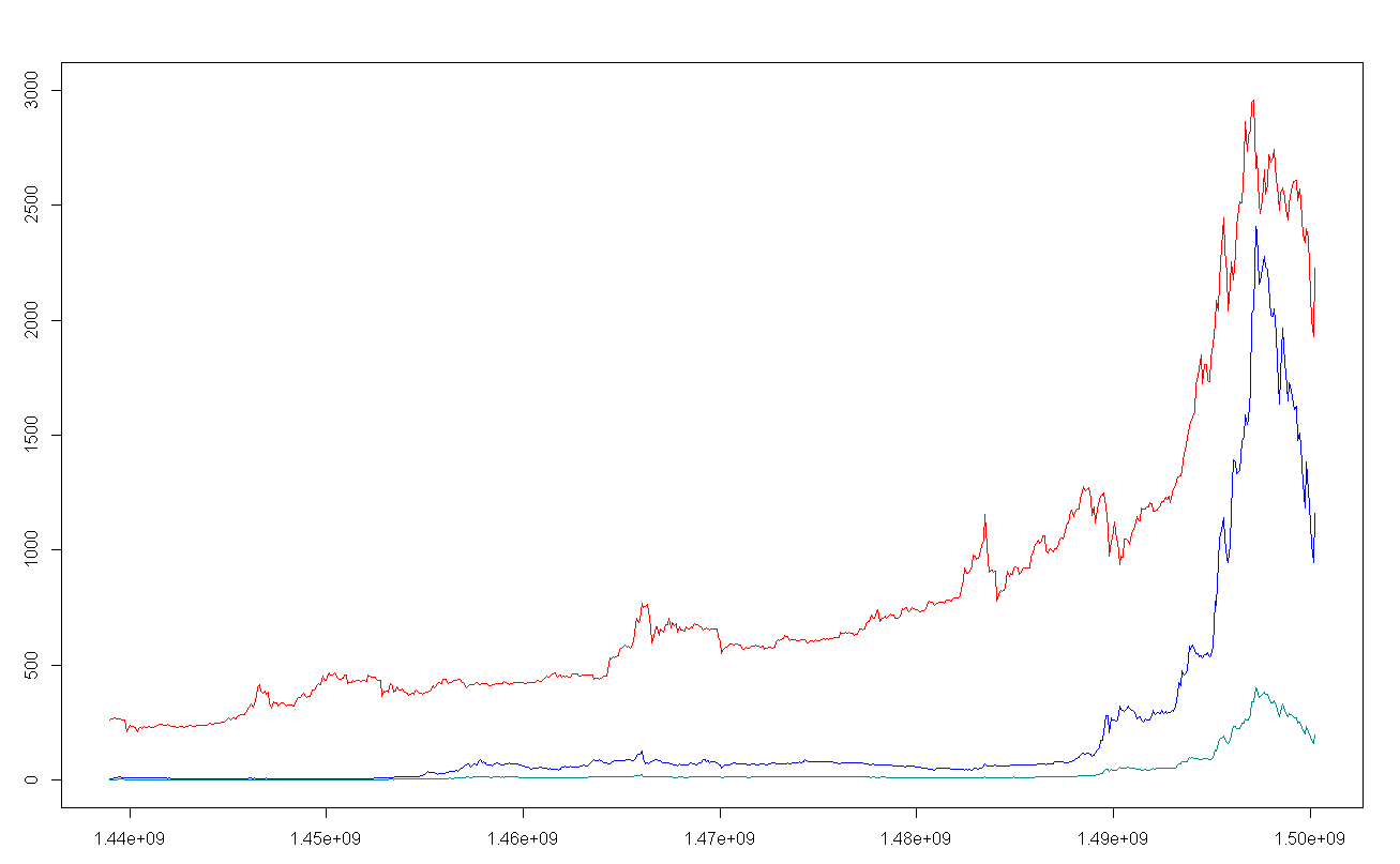
# load file into variable "file"
file <-read_excel(path='C:/Users/pat/Desktop/bothhh.xlsx')
btc <- rainbow::fts(x = file$date, y = file$btc)
eth <- rainbow::fts(x = file$date, y = file$eth)
eth6 <- rainbow::fts(x = file$date, y = file$eth6)
btc <- rainbow::fts(x = file$date, y = file$btc)
eth <- rainbow::fts(x = file$date, y = file$eth)
eth6 <- rainbow::fts(x = file$date, y = file$eth6)
# plot bitcoin data then ethereum and ethereum at a 6x multiple
plot(btc, plot.type = "functions", plotlegend = TRUE, col="red")
lines(eth6, plot.type = "functions", plotlegend = TRUE, col="blue
lines(eth, plot.type = "functions", plotlegend = TRUE, col="blue
lines(eth6, plot.type = "functions", plotlegend = TRUE, col="blue
lines(eth, plot.type = "functions", plotlegend = TRUE, col="blue
Linear Regression
These three linear regression models were produced with a program called "Maple" which is quite good when working with symbols and linear algebra.
GDP vs Amount of Arable Land
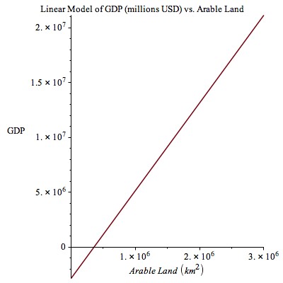
The system is overdertmined since there are more equations than unknowns.
Thus there exists no exact answer but one can be estimated using the sum of the least squares. See the next model a brief summary.
GDP vs Perceived Corruption
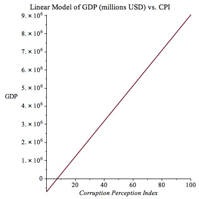
A simple linear regression model is of the form y=Xb + e and can be solved by multiplying the transpose of the
independent variable column vector by both the independent variable column vector and the dependent varibale column vector.
b is then expressed as the prodcut of those two quantities, ie b = (X^TX)^-1(X^T)y.
GDP vs Corruption and Land
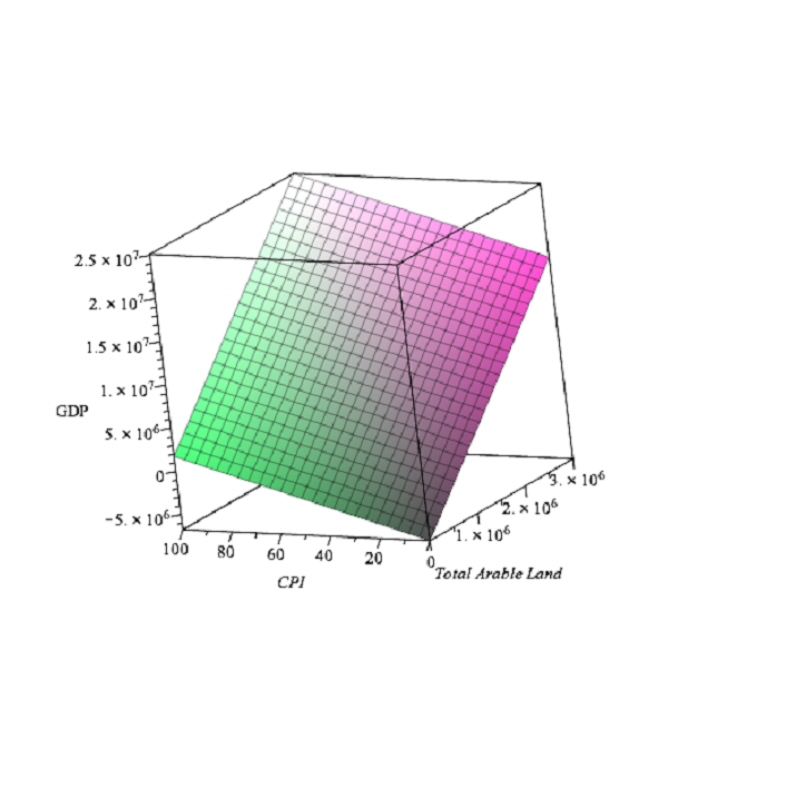
Resulting visualization for the multiple linear regression.